
SFG posts AI "photos" as in production photos?
In the latest update of "6: Siege - The Board Game Pre-order" Steamforge Games appears to have posted fake AI generated production floor images of their game, rather than real production photos. Am I seeing this right?
https://imgcdn.gamefound.com/richtextimage/richtext/4f9c6df3-9cbe-454f-ac8c-6c3e5dd6f738.png
https://gamefound.com/en/projects/steamforged-games/6-siege-pre-order/updates/21
For clarification:
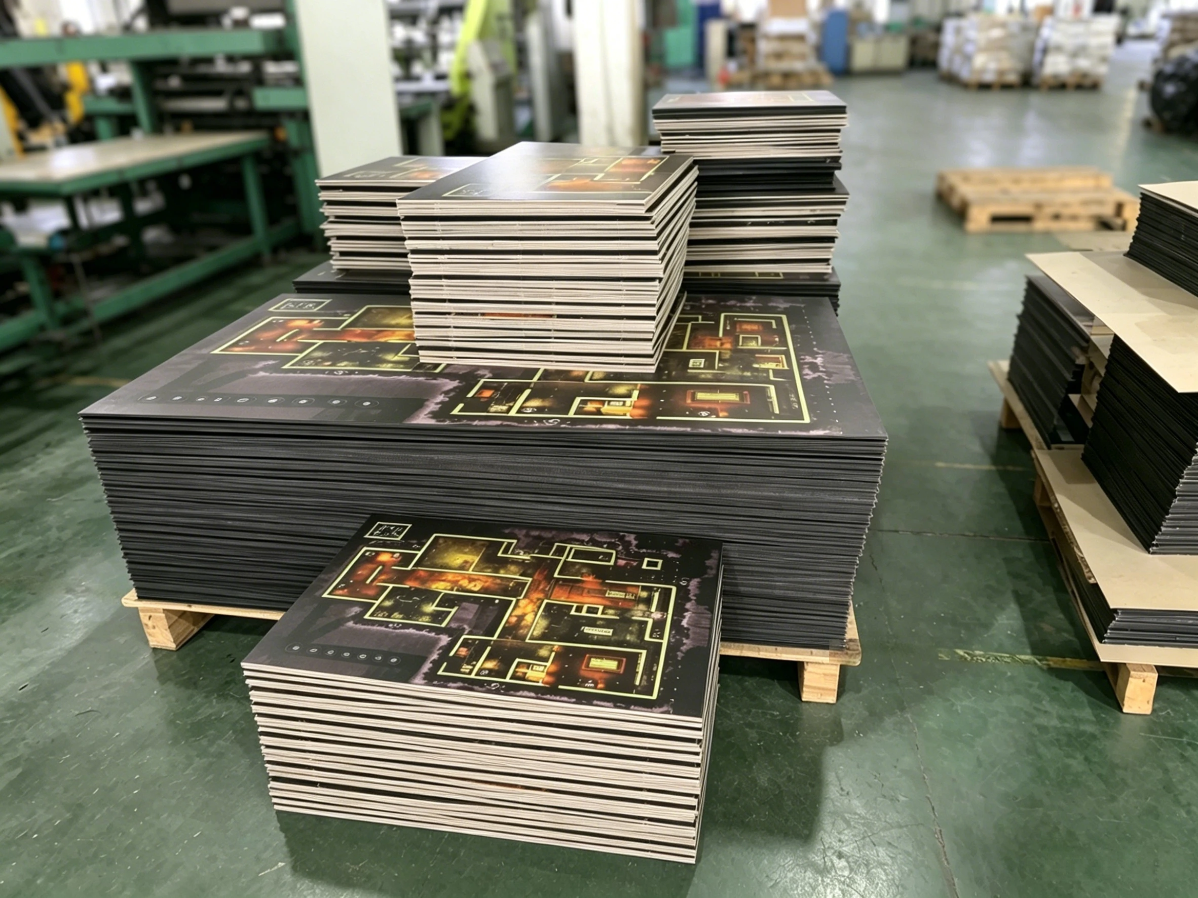
In the first linked image, zoom in on the board. The game board does not actually look like that. You see those circle blobs on the bottom left? Whats supposed to be numbers, counting from 0 to 5 or so. Instead, what you see is what looks like AI generated blobs. Kind of strange. Also, there is 2 sizes of board here. One large and one tiny. AFAIK there is no travel version of the game. Also, the walls and room in the board are blobbed and strange looking. More of an abstract copy, than the real thing (like AI does).
Also, if you look at the first image, the stack of boards at the front. The lines are wavy and blend into each other, not terminating normally.
Not as obvious, but noteworthy, looking at the large stack of massive boards, you can see at the left hand side the boards are neatly stacked, but if you look at the right, they are warped and veering off to the side.
From u/Conrad500 in the comments.
"The first picture is the worst, but the other 2 are fake too. The first picture shows the board taking up a full palette, which is not 24x36, and maybe I missed it, but do they even advertise smaller boards? The art is very wrong in them and while there's no ruler to make actual comparisons, the sizes are completely wrong (I worked at a print shop, so that part isn't obvious to anyone but people like me)
The second picture gets away with a lot more, but as someone who also knows how safety tape works in a warehouse, as well as lighting and ya know... palettes not being smaller than the thing you're putting on them (yeah, no palette uses the dimensions in this picture) it's also very obvious to ME, but this one I can forgive you if you couldn't tell its AI.
Picture 3 is also horrible. Easy to miss since they're background details like the safety poster? or how all of the saran wrap is not realistic or the chinese lettering on the plastic palettes are all different (should be stamps of the same symbols)
and Picture 4 is clearly just AI slop. Everything in the image is slop. Like, literally. looks like everything in the image is slurred around. You can't see any lettering and if you know how printing works, the colors that show on the side don't make any sense."